Highlights: swinging
time | morning time | the girls | fort time | book report time | commissary
time
5 layouts + 2 inserts + combo of typed & handwritten
journaling
Layouts 1 thru 3: is all about swing time with my 2 girls,
especially selene. She enjoyed herself so much. I couldn’t resist making this
event a 3-page layout. I took so many
photos that time and had a hard time picking which ones to include in my PL
album. But luckily, I had blogged a few
of the photos, so I used most of the photos I posted and slipped ‘em in page
protectors.
On layout 1, I had to glue dot the last 2 photos, because I
really didn’t want to split them in half since I was using the design B PL
protector. Glad I did b/c I it pretty
much worked out for the best especially since they are kinda the same “theme”
of my 2 girls backsides. I doodled a
subtle border on them with my sharpie metallic silver marker, wrote their names
and wrote “I love you” with the one with maiya in it (the lower left one). Also a little doodled borders on the 4x3
cards, the 1st with my metallic silver marked and the one with
journaling, I used a brown colored pencil.
Inserts:
the 1st is a cutout from a giada de
laurentis bucatini pasta box from target.
My 1st time to purchase a giada thang. That pasta turned out so good although I
don’t think I used that recipe on the insert.
Maybe someday I will.
The 2nd insert are posts from my blog.
I printed them on the same sheet of paper back-to-back just so I save the
trees. The 1st post was a timeline
I did on the 22nd. That was
soooo long! Not sure I would do that
again, but I’m glad I did include it in this album.
The other side was just about “chillin’” that
day. i doodled directly on the page protectors on both sides and also threw in
some blingy sequins from the cocoa daisy march 2013 “sketchbook” kit. Also attached a self-adhesive tab to the
insert to stand out from the layouts.
Layout 2: was photos,
photos, photos. I just stapled a “daily”
tab to the last photo.
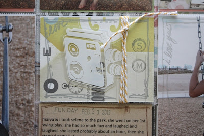
Layout 3: more photos & one 4x6 title card for this
whole swinging time. The card was a free download by molly porter.
threw in some blingy sequins from the cocoa daisy march 2013 “sketchbook”
kit. and added on top of the pocket,
some AC chipboard woodgrain letter stickers. You can’t see it on the photos
clearly, but I accented the letter stickers with my metallic silver marker.
Layout 4: I used the design A. I placed circle label
stickers where there was negative space or I just wanted to cover up some
unwanted objects. See the red/white journaling card? I made a boo-boo in printing it the wrong
way. But I came up with a solution as to not waste the ink I used and the
card…I printed it the wrong way again, on purpose. Kinda cool huh? I kinda feel
it adds a little fun to the card and the theme is kinda funny too. She was
definitely a chunk-a-dunk around this time.
Layout 5: added some memorabilia of receipts,
starbucks/itunes card and a cutout. Added some labels & doodling and this
layout was done!
i really love doing this project life thang!
it makes documenting everyday life, special occasions so much easier to put down into an album.
i've got a routine down now and the process is going so much smoother and faster...
and this album is getting thicker already.
looks like this 2012 will end being 2-3 albums.
we'll see.
thank you becky higgins for creating such a wonderful way of getting it done!
Supplies: Becky Higgins Project Life page protectors; Cocoa Daisy
March 2013 “sketchbook” kit; markers/pens: sharpie; colored pencils: crayola; stamps: hero arts, dear lizzy; chalk
ink: prima; self –adhesive tab: avery; labels: Martha stewart, avery; patterned
papers: echo park, studio calico, free
download journaling ampersand cards: molly
porter.


No comments:
Post a Comment